English
 简体中文
简体中文The same color will look different to different people. Due to differences in social roles and cultural backgrounds, people have different perceptions and preferences of color. From the consumer's point of view, cosmetic packaging itself needs to suit the aesthetic requirements of consumers at all different levels, and of course there will be a variety of differences in the requirements for product packaging colors.
1. Color and Age
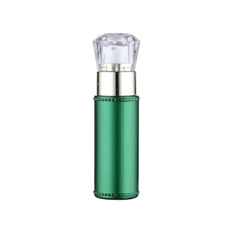
Consumers' perception of color varies depending on their age. With the growth of age, the preference for color will change greatly. Therefore, consumers of different ages have their own perceptions and feelings about color. Research shows that most children grow into adults from warm colors to cool colors, children's skin care packaging (Figure 1-1) color preference for red, orange, yellow and green warm colors, young people like to be different, like to seek different, strange, new, to this type of consumption as the target market of cosmetics packaging can boldly use forbidden colors, break with tradition, in order to lead the trend.
2. Color and gender
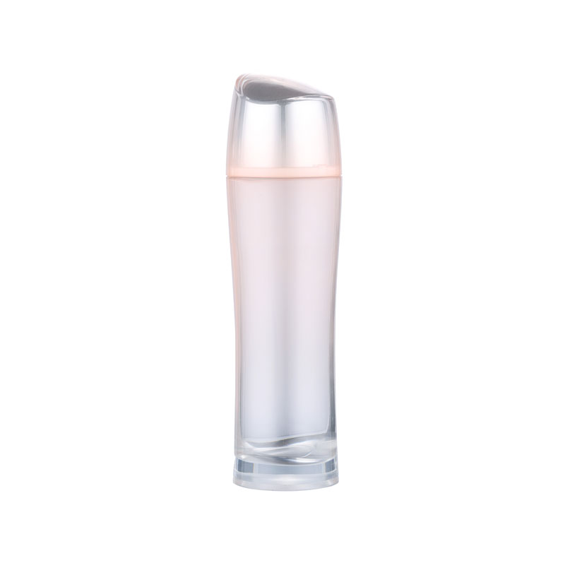
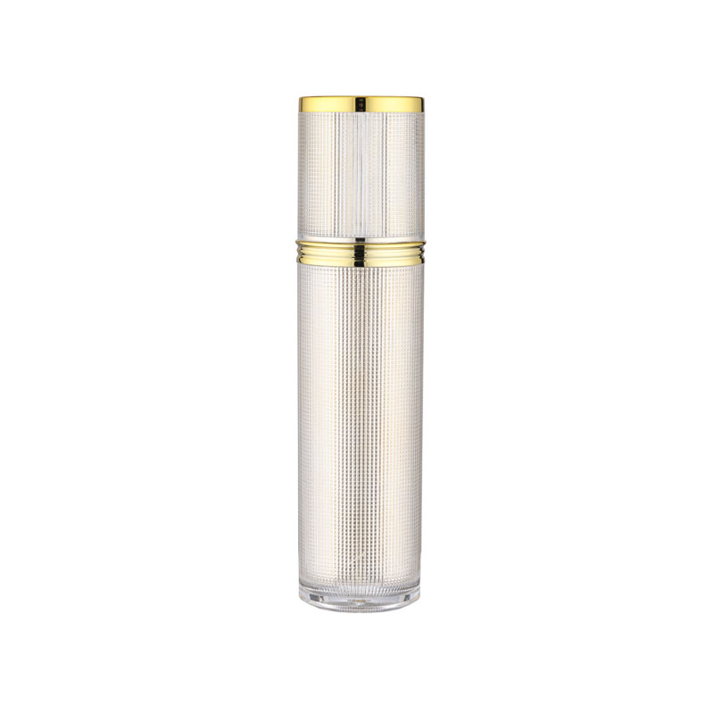
Consumers' emotions towards color vary according to gender. The same brand of similar skin care products, due to the differences in consumer gender, will choose different colors in the packaging. For example, Mansolaton Lip Balm for Men (Figure 1-2) uses black in its packaging, while the corresponding line for women (Figure 1-2) uses a relatively soft beige color. In general, the colors on the packaging of men's skin care products are mostly cooler, higher purity colors, such as black, white and gray colorless system and mostly gray. For example, the Gough men's skin care line (Figure 1-3) is mainly white and gray. Women's skincare products prefer warmer, less pure pink colors and white, for example, Lancôme Women's Moisture Edge Moisturizing Collection (Figure 1-4) is a light pink shade. In addition, men's favorite colors are generally similar and concentrated, while women's preferences vary from person to person with scattered shades. Psychological research shows that men are more governed by reason, while women are rich in feelings, emotions are easy to stimulate and generate, female consumers are susceptible to the influence of color, and they are naturally more sensitive to color. Therefore, female cosmetics packaging should pay more attention to the role of color. Novel packaging and appropriate color will have a strong appeal to women, creating a preconceived sense of goodwill and possibly stimulating their desire to buy.
3. Color and Region
In the color design of cosmetics packaging, in addition to the previously mentioned age, gender and other factors, for different regions, national customs, religious beliefs, cultural education and other factors are different, the perception of color is completely different. Cosmetic packaging color design, to master the national color like and taboo, a reasonable packaging color design. Most of the cosmetics are now widely sold in the international market, each country's preference for color is not the same, therefore, can not impose their own national color consciousness on others. For example, Americans prefer yellow and red, so American cosmetics are mostly made in yellow and red. The Japanese, on the other hand, prefer black, white, gray and cyan, so the color of Japanese cosmetics packaging is mostly white (Figure 1-5). China's traditional color is red, symbolizing festivity, warmth, happiness, etc., so domestic cosmetics packaging often has some big red accents.